Dark who? Dark mode has taken over the tech industry in all forms because it’s a huge battery saver and a lot easier on the eyes, especially at night time. It’s exactly what it sounds like—instead of the background of your phone or computer screen being white, it’s a very dark gray. With its rise in popularity, email folks like us have to pivot when it comes to design tips and tricks. If you’re reading this, you likely know how much time is spent building emails, filling them with strategic content, imagery, and CTAs meant to be clicked. Wouldn’t it be a shame if the color of a reader’s screen made it all a waste of time?
Not on our watch. Here are our top 4 tips for designing email in dark mode:
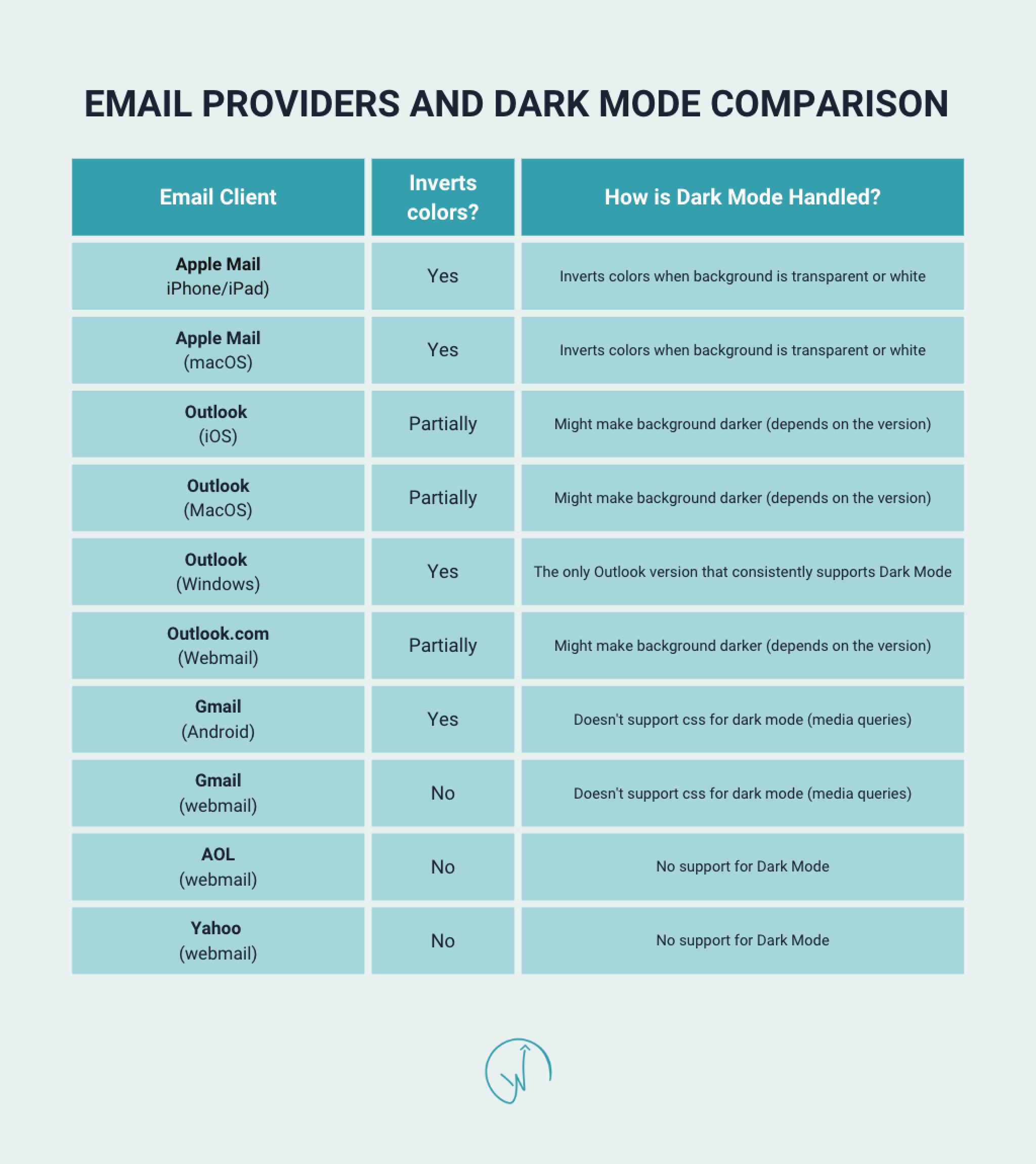
Know how different email providers perform in dark mode
Each email provider (Outlook, Gmail, MacOS, etc), reveals email design differently. Some providers will invert email designs fully, partially, or not at all. This means the email software can tell which recipients are reading in dark mode and can optimize emails based on that. Use your ESP (email service provider) to understand how much of your engaged audience falls into each email client bucket. This way you can design more effectively for your email program overall and not spend a lot of time on dark mode design specifically if only a small chunk of your audience is using it. Be sure to research before sending, and always send a test before deploying!
Use transparent images for email in dark mode
This is a great design tip in general, but especially for designing email in dark mode. This is usually accomplished by using PNG files, but can also be done in design tools like Canva (if you’re building your emails without a designer). If you use non-transparent images on a white background, it’s usually no big deal, since the white background of your image is blending in with the background of the screen. But the moment a user’s screen switches to dark mode, they can see the white outline of the image, which can look like careless design on your part. Team transparent images!

Outline dark text in white
If you’re using black text on a white background, that’s nothing groundbreaking, right? This tip is all about having a safety net, just in case your audience is reading your email in dark mode. Outline any dark text in white. This way it won’t get lost on a dark gray or black background in dark mode. The outlined text won’t show up on your white background anyway. Don’t let your well thought out email copy go to waste!

Stick to plain text
Non-formatted text is plain text. There are no varying sizes, bolding, underlining, different fonts, etc. It’s just, well, plain text! Since you’re not sure if your recipients are using light or dark mode, it’s better to play it safe. Use less design elements that have the chance to render improperly. Even the most skilled email experts are still learning why dark mode doesn’t always allow your emails to render properly.
Ready to start designing for dark mode? If you need more email design support or tricks, send us an inquiry here. Talk with Wayfinder about turnkey ways to safeguard and strengthen your email marketing strategy against dark mode and more!

